Flex Basics
Flexbox (Flexible Box) is a direction-agnostic layout model which makes it more efficient to arrange and align items within a container. Unlike the direction-specific display of block (vertical) and inline (horizontal) objects, flex objects can be ordered in two directions, and can also expand to fill available space and shrink to prevent overflow. (Flexbox is a proposed recommendation to W3C. It is not yet a final component of the CSS3 standard.)
> See A Complete Guide to Flexbox on css-trick.com.
Some flexbox properties can be added to parent items (flex containers) while others are to be used on children (flex items).
The Flex Container
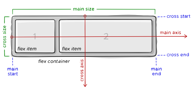
- main axis – The primary axis along which flex items are placed. Direction may not always be horizontal, depending on the
flex-directionproperty. - main-start | main-end – Flex items appear within the container starting from main-start and going to main-end.
- main size – A flex item’s width or height, whichever is in the main dimension.
- cross axis – The axis perpendicular to the main axis. Its direction depends on the main axis direction.
- cross-start | cross-end – Flex lines are filled with items and placed into the container starting on the cross-start side of the flex container and going toward the cross-end side.
- cross size – The width or height of a flex item, whichever is in the cross dimension, is the item’s cross size property.
Properties for Flex Containers
display – defines a container as being flex, inline or block (default). All direct children will have flex context.
.container {
    display: flex; /* or inline-flex */
}
flex-direction – establishes the main-axis, defining the direction flex items appear in the flex container, either in horizontal rows or vertical columns.
.container {
    flex-direction: row | row-reverse | column | column-reverse;
}row(default): left to right inltr; right to left inrtlrow-reverse: right to left inltr; left to right inrtlcolumn: same asrowbut top to bottomcolumn-reverse: same asrow-reversebut bottom to top
flex-wrap – default behavior is for all items to try to fit in one line. This can be overridden by the flex-wrap property:
.container {
    flex-wrap: nowrap | wrap | wrap-reverse;
}nowrap– (default behavior): all flex items will be on one linewrap– flex items will wrap onto multiple lines, from top to bottom.wrap-reverse– flex items will wrap onto multiple lines from bottom to top.
flex-flow
justify-content
align-items
align-content
Properties of Flex Items
- order
- flex-grow
- flex-shrink
- flex-basis
- flex
- align-self