Overview
In this exercise we will use basic HTML structural elements and CSS style rules to create two web pages: a home page that links to a second page containing a Mondrian-like graphic generated with CSS.
HTML
HTML is plain text surrounded by tags (markup) which define the structured content of a page. Tags define give structure of the content of a page.
Structure
The structure of a document can be described by how a page is built. Think of a term paper — there might be a main Heading, a list of contents, subheadings, and a number of paragraphs.
Content
Content can be text, images, video or interactive media.
Watch “Don’t Fear HTML” about understanding tags.
- Structural tags, like headings
<h1> through <h6>paragraphs<p>and lists <ul> or <ol> define the hierarchical flow of elements on a page. Hierarchy refers to a logical progression of the importance of items on a page: <h1> is the most important headline; <h2> second most important; and so on.
Common Structural Tags
<div>divisions<h1>through</h6>><h6>headings<p>paragraphs<ol>,<ul>and<li>lists and list items<blockquote><b> bold <i> italic <a> anchor (links) <span>
- Semantic tags give extra info about the content within, like defining a collection of paragraphs and headings as an <article> or where to place
<em>emphasis in a sentence.
Common Semantic Tags
<header>
<nav>
<main>
<section>
<article>
<aside>
<figure>
<footer>
Most elements begin with an opening tag, like <p> preceding some content, and then ends with a closing tag, </p>.
A few elements are self-closing and are not wrapped around content. They are called empty elements and written differently:
<img />image- <hr /> horizontal rule
- <br /> line break
Structure – Not Style
Even though each browser has a default way of rendering the look of a tag <h1> heads are the largest and boldest, <h2> is smaller, and so on) HTML tags must not be used to define the look of content (style.) Instead, tags should logically define the structure of a page, representing the relative importance and structural aspects of each chunk of information being presented: <h1> elements are the most important, <h2> elements are secondarily important, and so on. This is crucial for accessibility — allowing a screen reader to assist a blind person’s understanding of the information.
Required HTML Page Elements
Every HTML page must be minimally structured with these required elements:
<!DOCTYPE html>
<html>
     <head>
     </head>
     <body>
     </body>
</html>
The first line must begin with <!DOCTYPE>. This is not an HTML element, but it tells the browser what language it’s about to read. We use <!DOCTYPE html> for HTML5.
- The data within the
<html>tags makeup the HTML document. - The data within the
<head>tags contain information (metadata) about the page that will not be visible in the browser window. - The data within the
<body>tags contain the content that will be visible in the browser window.
Common HTML elements:
Most HTML elements are either block level or inline.
- Block level elements usually start and end with a new line in a browser.
- Inline elements are displayed next to each other (as space allows) without starting a new line.
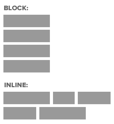
Common Block Level Elements
(Start on a new line and cause a new line to be created at the close.)
<h1>through<h6>Head 1 through Head 6<p>paragraph<ul>unordered list (bullets)- contains
<li>list items
- contains
<ol>ordered list (numbered)- contains
<li>list items
- contains
<div>division (container)<table>array of data, like a spreadsheet<tr>table row<td>table data
Common Inline Elements
(Do not cause a line break.)
<em>emphasis, or implied importance (looks like italic)<i>italic – looks like emphasis, but semantically implies “an alternate voice or mood.”<strong>implies extra importance (looks like bold)<b>looks like bold, but semantically used “to be stylistically offset from the normal prose without conveying any extra importance.”<span>range of selected text, commonly used to apply a define a class to which a style can be applied<a>anchor (links)
<img> tag
- The image tag
<img>defines a placeholder for a referenced image file. It behaves either as an inline element or a block element depending on it’s placement.
For a complete list of HTML elements, see MDN’s HTML5 Reference.
File Naming Considerations
- HTML file names must not contain spaces or punctuation other than a hyphen, underscore, and period.
- The “home page” of a website must always be named “index.html”, and be located at the top level of the Site folder.
- All files, including HTML and media/image files, must have an appropriate suffix, such as .html, .jpg, .gif, .png, etc.
CSS
Cascading Style Sheets (CSS) is a set of formatting rules that determine the look and position of HTML elements on a page.
CSS rules are applied to HTML elements based on selectors and declarations.
Selectors determine which HTML element a style should be applied to, such as:
- tags:
<p> - classes: can be applied to any element, such as
<span class="boldRed">. In the CSS, class names begin with a dot, such as.boldRed. - IDs: specify a style for a single, unique element, such as
<div id="MainContent">. In the CSS, ID names begin with a #, such as#MainContent. - pseudo-classes: add custom looks and behaviors to certain selectors, such as a property when the mouse is hovered over a link, or the style of a visited link.
Selectors may also be grouped and nested within each other. Both block level and inline elements can contain any number of classes, and selectors may define certain classes that are only within other classes. Rules can be applied in very complex and powerful ways in both broad and very focused ways.
Declarations consist of a property and a value. The property is the style attribute (like color or margin) that you wish to change. Each property has a value (like “red” or “20px”).
Common CSS Properties:
- color
- text-align
- line-height
- font-family
- font-size
- font-style
- font-weight
- background-color
- background-image
- background-repeat
- list-style-type
- margin
- padding
- border
- float
- clear
For a complete list of CSS properties, see MDN’s CSS Reference.
Hyperlinks
Hyperlinks, or <a> anchor tags, are the heart of HTML. Clicking a link sends a request to a web server to send a different page (or part of a page) to the browser.
An anchor tag contains the href attribute which holds the address, or path, to the location of the new page, in the form of a URL. The href can point to a location either on the same website or on a different site altogether.
<a href="artists/abstractexpression/kandinsky.html" title="Kandinsky's Composition with Red, Blue, and Yellow">Walter Kandinksy</a>The title attribute reveals a tooltip when the mouse hovers over the link.
Note: If the location of the linked page changes, or if the file name is changed, the link must be updated to reflect the new path, otherwise a 404 (Page Not Found) error will result.
Color
Colors in HTML and CSS code are usually specified as hexadecimal, though certain color names can also be used.
- Hexadecimal codes use combinations of six (hex) letters, A – F and 10 (decimal) numbers, 0 – 9.
- A pair of characters in hex code (one byte) can represent a value from 0 (
00) – 255 (FF). - Three pairs of characters (three bytes) represent the amount of Red, Green and Blue in a color.
- Occasionally pairs with repeating characters will be abbreviated from six characters to three , e.g. #00BBFF becomes #0BF.
- Image editing programs can give you the Hex value of a color swatch.
Part 1: index.html and style.css
The VS Code Text Editor
We will be using the free Visual Studio (VS) Code text editor from Microsoft. This editor is install in the GDAT Labs. If you are using your own computer, download and install as directed.
Create the HTML Structure
- Launch VS Code and create a New file. Save it as index.html into a folder on your desktop named yourlastname-ex01.
- Copy the HTML code below, then paste it into your index.html document.
<!DOCTYPE html>
<html>
   <head>
     <meta charset="UTF-8">
     <title>ART 320 Exercise 1</title>
     <meta name="viewport" content="width=device-width, initial-scale=1">
     <link href="style.css" rel="stylesheet">
   </head>
   <body>
   </body>
</html>
- Type shift-option(alt)-F to Format (auto-indent) the lines of code.
- Save index.html.
Create the CSS formatting
- Create a new file in VS Code. Save it as style.css into your ex01 site folder.
- Copy the CSS code below, and paste it into style.css.
/* CSS Document */ /* Universal Selector Reset */ * {margin: 0;padding: 0;box-sizing: border-box;} /* End Reset */ body { background-color: #d5d7ff;min-height: 100vh; text-align: left; font: 12px/1em "Lucida Grande", Lucida, Verdana, sans-serif; }#wrapper { margin: 0 auto; width: 960px; }h1 { font-size: 1.5em; color: #639; margin-bottom: 1.5em; } h2 { font-size: 1.3em; line-height: .5em; margin-bottom: 1em; } h3 { font-size: 1.1em; } header { width: 900px; padding: 20px; } main { width: 900px;padding: 20px;} nav { background-color: #000; padding: 15px; width: 900px; height: 40px; } .headernav { font-family: "Courier New", Courier, monospace; font-size:1.1em; white-space: nowrap; display: inline; list-style-type: none; padding-right: 1.5em; }.headernava { color: #FFFFFF; }
- Type shift-option(alt)-F to Format (auto-indent) the lines of code.
- Save all (both index.html and style.css) by hitting option-command-s.
- View index.html in your browser by double-clicking the file in Finder,
If the page does not open in your default browser as expected, you may need to right-click the html file and and choose Open with… to open in a different browser. (Safari, in particular, does not like to open html files that reside on a cloud drive.) - In style.css, change the value for the
background-colorproperty in thebodyrule. Use this chart to pick from, or mix your own in an image editing app. - Save style.css.
- Reload (command-R) the page in your browser and note the new background color.
Create Content
- Copy and paste the code below into your index.html file, between the
<body>tags.
(Code appearing within the<!-- -->tags are comments that are ignored by the browser but readable by humans. They do not show on the page.)
<div id="wrapper">
    <header> <!-- Contains the site identity and navigation -->
        <h1>ART 320 Exercise 1 — HTML & CSS Basics</h1>
        <nav> <!-- Contains a list of site navigation links -->
           <ul>
             <li class="headernav"><a href="index.html">Home</a></li>
             <li class="headernav"><a href="cssmondrian.html">CSS Mondrian</a></li>
           </ul>
        </nav> <!-- close nav -->
    </header> <!-- close header -->

    <main>
        <h2>This is the main content container</h2>
        <p>This is a paragraph element. Please add one or two more.</p>
        </main> <!-- close main content -->
</div> <!-- close wrapper -->
- Save index.html.
- Add space below each paragraph by creating a rule for <p>:
p {
margin-bottom: 1em;
} - Reload (command-R) the page in your browser and view the new content.
Part2: CSS Mondrian
Adapted from googlecreativelab.github.io
Developer Tools (Inspect Element)
The browser’s code inspector is an important useful tool to understand how a page is built, and to help troubleshoot your code.
- Use Developer Tools (or Inspect Element) to preview the end result of the Mondrian page:
- Right-click on the Mondrian to reveal HTML and CSS Source code. (If using Safari for the first-time, go to Preferences>Advanced and click to “Show Develop Menu”. This step is not necessary in other browsers.)
- Arrange the code inspector to show HTML and CSS code side by side.
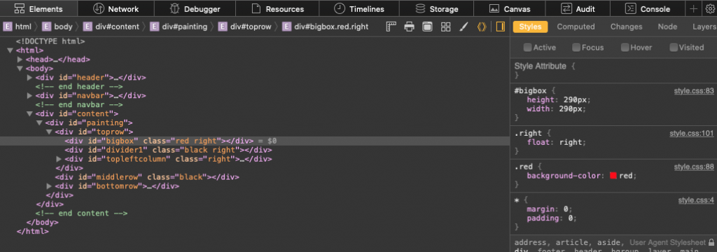
- Mouse-over different lines of code and notice which areas of the design become highlighted.
- Save file index.html then duplicate it by choosing File>Save as… and name it cssmondrian.html, into the same folder as index.html
- Click to download ex01 Resources from the UBbox ART 320 Downloads folder.
• View the jpg for Mondrian’s Composition with Red, Blue, and Yellow.
• View the measurements.jpg which represents the painting in the form of a wireframe, or blueprint. The painting has been broken down into a grid with calculated measurements, based on an overall size of 400px square. - Open cssmondrian.html and replace the lines between the opening and closing
<main>tags with the below code:<div id="painting"></div> - Open your style.css file and paste the following code on a new line at the bottom:
#painting { margin-left: auto; margin-right: auto; margin-top: 100px; width: 400px; height: 400px; background-color: #fff4db; box-shadow: 10px 10px 0px #8d8d8d; } - Create divs based on an analysis of the painting. Each row, column and box will have it’s own unique CSS #id and a corresponding HTML div. Starting with the top row we see one large box on the right and two smaller boxes stacked vertically on the left, each separated by black dividers.
Between the opening and closing #painting div tags in the HTML, add:<div id="toprow"></div> - In the CSS, add the following rule on a new line at the bottom:
Note that #toprow won’t be visible — it serves as a container for the other boxes in that row.#toprow { height: 290px; } - An easily reusable color palette can be created by creating variables for each color. Global variables can be used throughout your CSS, and can change based on screen size (more on Responsive Design in Exercise 2)In the CSS, add the below rules:
:root { --red: #ff6f69; --blue: #3e42ec; --yellow: #eee352; --black: #535054;} - Make the large box by first adding a div between the opening and closing #toprow div tags in the HTML:
<div id="bigbox"></div> - Add size, position and color to the large box b adding the below rule to the CSS:
#bigbox { height: 290px; width: 290px; background-color: var(--red);} - A note about floats: Most elements can have a float style applied to them via CSS. A float changes the behavior of a block level element — it removes the line break and causes the element to flow in-line, either to the Left or the Right.
“Float” the box to the right. First, create a .right class whose float property has a value of “right”:.right { float: right; } - Then apply the .right class to #bigbox:
<div id="bigbox" class="right"></div> - After the closing #bigbox div in the HTML, add:
<div id="divider1" class="right"></div> - Add the below code to the CSS to add size and color #divider1:
#divider1 { height: 290px; width: 10px; background-color: var(--black);} - The #topleftcolumn will contain three stacked boxes: two with the .mediumbox class and one horizontal #divider2 between. Note that #topleftcolumn won’t be visible – it serves as a container for the other three boxes.
- After the closing #divider1 div in the HTML, add the below code. Pay attention to the nesting of the three boxes within the #topleftcolumn div:
<div id="topleftcolumn" class="right"><div class="mediumbox"></div><div id="divider2"></div><div class="mediumbox"></div></div> - Create the below CSS to add see, color and position to the #topleftcolumn elements:
.mediumbox { height: 140px; width: 100px; } #divider2 { height: 10px; width: 100px; background-color: var(--black); } - The #middlerow div comes next. It flows after the closing #toprow div:
<div id="middlerow"></div> - Create the CSS for the #middlerow, and continue to fill in the #bottomrow using the HTML and CSS you’ve just learned.
- When completed, submit your folder, named with your last name first, to UBbox ART 320 – Uploads> Exercise 01 Submit.