Flexbox
Flexbox (Flexible Box) is a direction-agnostic layout model which makes it more efficient to arrange and align items within a container. Unlike the direction-specific display of block (vertical) and inline (horizontal) objects, flex objects can be ordered in two directions, and can also expand to fill available space and shrink to prevent overflow.
In the flex layout model, the children of a flex container can be laid out in any direction, and can “flex” their sizes, either growing to fill unused space or shrinking to avoid overflowing the parent. Both horizontal and vertical alignment of the children can be easily manipulated. Nesting of these boxes (horizontal inside vertical, or vertical inside horizontal) can be used to build layouts in two dimensions.
W3C
Flex Containers and Flex Items
Some flexbox CSS properties are added to parent items (flex containers) while others are to be used on children (flex items).
The Flex Container
If “regular” float-based layout is based on both block and inline flow directions, the flex layout is based on flex-flow directions. This figure explains the main idea behind the flex layout.
- main axis – The primary axis along which flex items are placed. Direction may not always be horizontal, depending on the
flex-directionproperty. - main-start | main-end – Flex items appear within the container starting from main-start and going to main-end.
- main size – A flex item’s width or height, whichever is in the main dimension.
- cross axis – The axis perpendicular to the main axis. Its direction depends on the main axis direction.
- cross-start | cross-end – Flex lines are filled with items and placed into the container starting on the cross-start side of the flex container and going toward the cross-end side.
- cross size – The width or height of a flex item, whichever is in the cross dimension, is the item’s cross size property.
CSS Properties for Flex Containers
- display
- flex-direction
- flex-wrap
- flex-flow
- justify-content
- align-items
- align-content
- gap, row-gap, column-gap
display
— defines a container as being flex, inline or block (default). All children will behave as flex items.
.container {
    display: flex;
}
flex-direction
— establishes the main-axis, defining the direction flex items appear in the flex container, either in horizontal rows or vertical columns. The cross-axis direction crosses the main-axis. For example, if the direction is row, and by default points left to right, the cross-axis is top to bottom.
.container {
    flex-direction: row | row-reverse | column | column-reverse;
}
row(default — you can leave this property out and direction will default to row): left to rightrow-reverse: right to leftcolumn: same asrowbut top to bottomcolumn-reverse: same asrow-reversebut bottom to top
flex-wrap
— default behavior is for all items to try to fit in one line. This can be overridden by the flex-wrap property:
.container {
    flex-wrap: nowrap | wrap | wrap-reverse;
}
nowrap– (default behavior): all flex items will be on one linewrap– flex items will wrap onto multiple lines, from top to bottom.wrap-reverse– flex items will wrap onto multiple lines from bottom to top.
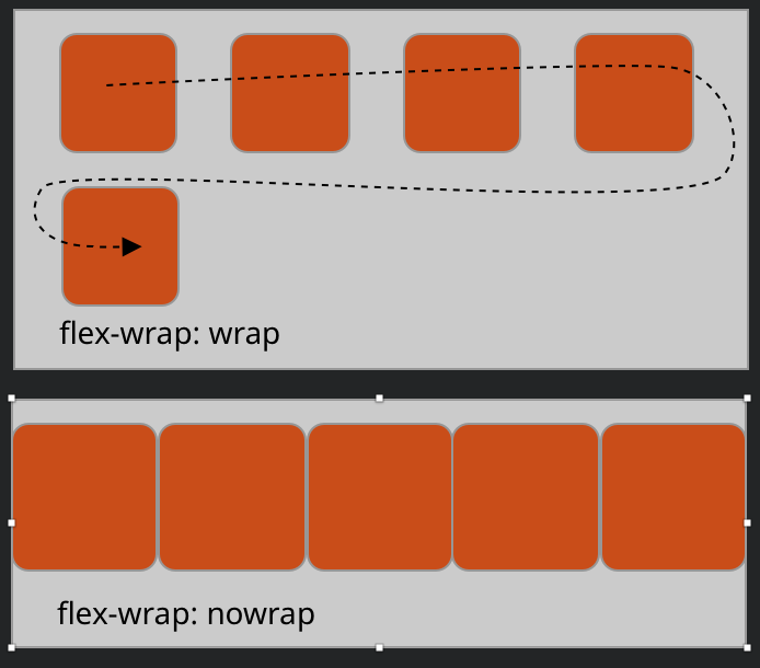
Note: Flex will attempt to accommodate your item widths, but it will narrow the items to fit when set to nowrap .
Also note: flex items will stretch to fill their parent’s height, unless given their own height, or if wrap is applied.
flex-flow
This combined both flex-direction and flex-wrap into one property, which together define the flex container’s main and cross axes. The default value is row nowrap.
.container {
      flex-flow: column wrap;
}
justify-content
— determines distribution along the main-axis.
.container {
    justify-content: flex=start | flex-center | flex-end… ;
}
flex-start(default): items gathered toward the start of the flex-direction.center: items centered together along the line.flex-end: items gathered toward the end of the flex-direction.space-between: distributes items evenly in the line; from the start line to the end line.space-around: distributes items evenly in the line with equal space around before and after the item.space-evenly: items distributed so that the spacing between any two items (and the space to the edges) is equal.
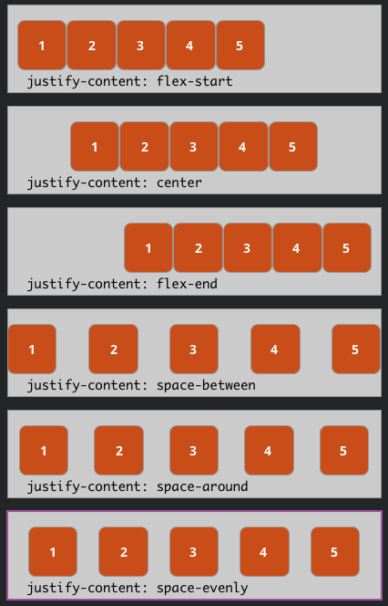
Note: when using flex-direction: column, the parent container must have a height set, otherwise items will fill the space vertically.
align-items
— determines how flex items are distributed along the cross-axis. For example, when using flex-direction: row, align-items works vertically (perpendicular to the main-axis.)
.container {
    align-items: stretch | flex-start | flex-end | center | baseline… ;
stretch(default): stretch to fill the container’s height.flex-start: items are placed at the start of the cross-axis.flex-end: items are placed at the end of the cross-axis.center: items are centered in the cross-axis.baseline: items are aligned according to their baselines, especially useful for text.
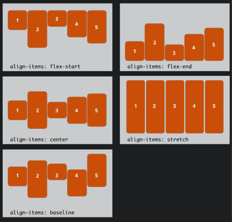
Note: Parent containers must have a defined height for align-items to function properly.
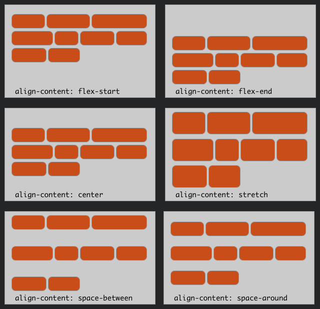
align-content
— determines how a container’s lines are distributed when there are multiple lines of code and extra space in the cross-axis.
.container {
    align-content: stretch | flex-start | flex-end | center | baseline… ;
}
- normal (default): items are packed in their default position as if no value was set.
flex-start: items packed to the start of the container.flex-end: items packed to the end of the container.center: items centered in the container.- space-between: items evenly distributed; the first line is at the start of the container while the last one is at the end.
- space-around: items evenly distributed with equal space around each line.
- stretch: lines stretch to take up the remaining space.
gap, row-gap, column-gap
—controls the space between flex items. It applies that spacing only between items not on the outer edges.
.container {display: flex;gap: 10px;gap: 10px 20px; /* row-gap column gap */row-gap: 10px;column-gap: 20px;}
CSS Properties for Flex Items
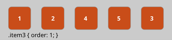
order
— by default flex items appear in the order they are written in html. You can alter the order of one or more items by setting an order value:
.item {
    order: 1; /* default is 0 */
}
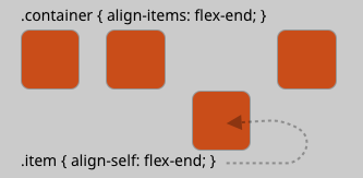
align-self
— allows individual flex items to be assigned an alignment different from the alignment set for the container..
.item {
    align-self: auto | flex-start | flex-end | center | baseline | stretch; }
flex (flex-grow, flex-shrink, flex-basis)
.item {
   flex: none | [ <'flex-grow'> <'flex-shrink'>? || <'flex-basis'> ]
}
.item1 {
flex: 10 5 400px;
}— Used when you have too much space or not enough space for your items. Sets an item to expand or shrink a proportionate amount.
flex-grow — Defines proportionally how much a flex item can grow to fill excess space if necessary. It accepts a unitless value that serves as a proportion. Default is 0.
flex-shrink — Defines proportionally how much a flex item can shrink to fit into a narrower space, if necessary. Default is 1.
flex-basis — Defines the default size of an element before the remaining space is distributed. Default is auto.
flex — the shorthand for flex-grow, flex-shrink and flex-basis combined. The second and third parameters (flex-shrink and flex-basis) are optional. The default is 0 1 auto.
More Flex Learning Resources
Instructions
In this exercise we will be creating a simple website using CSS Flexbox to layout our elements, including positioning nav within header and arranging thumbnails in a flexible grid.
Create a flex-based nav bar
Step 1: Download and unzip the Exercise 3 Starter Files. Add your last name before the folder name.
Launch VS Code, then drag the exercise folder to the VS Code icon in your doc to see the files in the Explorer panel.
Step 2: View index.html in your browser using Responsive Design Mode. Note at narrow widths the nav items reflow awkwardly.
Examine the nav element in the html and css which uses the float techniques from previous exercises. While the item width is fluid (%) the nav can only accommodate a specific number of items before the line reflows. Adding a new link to the nav bar would require modifying the code.
Step 3: Using a flex approach, the nav ul will become the flex-container and the ul li‘s will be the flex-items.
Add a class to the ul html tag inside the nav element:
<ul class="flex-nav">Add this rule for the new class, in the section at the bottom commented: /* Flex Container */
ul.flex-nav { display:flex;justify-content: space-around;gap: 10px;}
Note that once display: flex is applied, the items spread out, taking up just as much room as they need.
Step 4: Add the flex property to the list items:
Add this rule for the new class, in the section at the bottom commented: /* Flex Item */
.flex-nav li {
       flex: 0 1 auto; /* flex-grow flex-shrink flex-basis */
 }
Step 5: Adjust the flex to wrap the nav items every at two breakpoints:
@media all and (max-width:600px) {
   ul.flex-nav {
        flex-wrap:wrap;
   }
   .flex-nav li {
        flex: 1 1 50%;
   }
}

@media all and (max-width:400px) {
   .flex-nav li {
        flex-basis:100%;
    }
}
Create a flex-based image thumbnail gallery
Step 6: Open the gallery.html starter file in VS Code. Note that the height has been set to 100vh for initial visibility before content is added. A red border has been applied to help visualize the container.
Add nav ul to the .flex-nav class as on index.html.
Step 7: Embed eight images into the gallery div using the below code, modifying each line for all images:
<img src="images/thumbs/bird1.jpg" alt="Bird" />
Change the #gallery height value from 100vh to auto.
View gallery.html in your browser and notice the layout of the thumbnails at different page widths.
Step 8: Add these three lines of code to #gallery, one line at a time, observing the results each time:
  display: flex;
  flex-wrap: wrap;
  justify-content: space-around;
Experiment with different values for each property, then return to the above.
Step 9: Add the below line to the #gallery > img rule:
align-items: flex-start;
Experiment with different values for the property, then return to the above.
Remove the #gallery border property.
Step 10: Save all files and upload completed site folder, making sure your last name in in the title, to the Exercise 3 Box folder.
Option: Make bird1 clickable and link to the full size version of the image.