
Overview
Animation is the change in the shape, size, color, orientation or position of an element over time, in either a two- or three-dimensional direction.
Interactivity is when an animation or change in the state of information occurs as a result of a user action.
Beyond entertainment, animation and interactivity can be used to provide visual feedback which reassures the user that their actions have achieved the desired consequence.
Purposeful animation and interactivity can also be used to enhance the meaning of information being delivered.
Animation
Animation is an optical illusion whereby sequences of still images (frames) flashed before the eyes are perceived by the brain to be connected, creating a sense of fluid motion.
Conventional (film-based) animation displayed stills at a rate of 24 frames-per-second (fps). Modern digital video is commonly shot at 24 fps to simulate a cinematic feel, 30 fps, or 60 fps.
Digital animation created in apps like Adobe Animate, After Effects, or ToonBoom can be set at many different rates. Simple animation might be adequately replayed as low as 5 fps, but 12 is considered a more common minimum. If the frame rate is too low for a given sequence, the illusion will be lost at the playback will appear stroboscopic or flickering.
Historically, senior animators would draw “key” frames of an animation, and junior animators would draw the “in-between” frames, or “tweens“. In the digital world, the computer draws the tweens.
CSS shares this concept with animation apps: You set the keyframes, and the CSS works with the browser to create the tweens.
Animation Can Add Life to Inanimate Objects
For more than a century, animators have been guided by Disney’s “12 Principles of Animation”. Animation that includes these visual qualities aides our suspension of disbelief so that we can empathize with otherwise inanimate objects and illustrated characters. See “Understand Disney’s 12 Principles of Animation” from creativebloq.com.
CSS Animation
- CSS Animation uses only HTML and CSS that you are already familiar with.
- Animation can be used to provide visual feedback on interactive elements including nav links and buttons.
- Any HTML element can be made to change over time (position, scale, rotation…)
- Any motion (or sound) on a web page should be added with consideration to accessibility and user experience. See Nielsen/Norman Group article on “Executing UX Animations: Duration and Motion Characteristics“
- Other options for adding motion to the web
- JavaScript
- SVG
Examples of types of animation from Daniel Eden.
(View and copy the CSS source code to add these animations to items on your pages. Be sure to credit the original source.)
Simple CSS animations include:
- a keyframes rule
- an animation name to refer to
- a class to which can be added HTML elements that are to be acted upon
Keyframe Rules
Keyframe rules are a list of actions that describe what properties will change and when over time. Keyframes can be declared as points along a timeline either using the keywords from and to; or by using a percentage.
In this example, drive is the name of the animation that will be created. The from point is 0, or the object’s current position. The property that will be changed is transform and the attribute is translateX to a value of -400px. In other words, the object will begin movement from it’s original location to a point 400px along the X axis to the left.
@keyframes drive {
   from {transform: translateX(0);}
   to {transform: translateX(-2000px);}
}
Percentage measurements are useful when animating among more than two states.
@keyframes drive {
   0% {transform: translateX(0);}
   30%  {transform: translateX(-50px);}
   100% {transform: translateX(-2000px);}
}
Assigning the Animation to an HTML Element
A class which calls a keyframe rule can be assigned to an HTML element. The class can contain a number of properties (see below.)
.car {
    animation-name: drive;
    animation-duration: 2s;
    animation timing-function: ease-in;
    animation-iteration-count: 1;
    animation-fill-mode: forwards;
    animation-delay: 3s;
}
Animation Properties
animation-name
used to refer a CSS rule to a keyframe ruleanimation-durationaccepts values in seconds (s) and milliseconds (ms)animation-timing-function:ease-inorease-out
Easing is the way speed is distributed across the duration of an animationanimation-iteration-count
determines the number of times the animation will loopanimation-delay
accepts values in seconds (s) and milliseconds (ms)animation-fill-mode:forwards,backwards, orboth
Retains the objects style and returns it to either the first keyframe (backwards) last keyframe (forwards) or retains the styles at both keyframes (both.) Can be use to reset the objects position.
For a complete list, see MDN’s List of Animated Properties.
Instructions
Part 1: Examine the PrettyPhoto Javascript/JQuery Script
- Download the Ex05 Starter Files. (On a Mac, if your browser does not automatically expand the .zip archive, double-click on it to extract the folder. On Windows, select the downloaded .zip archive and click the Extract button at the top of the File Explorer window.) Add your last name to the beginning of the folder name.
- Open gallery.html in your browser. Click on one of the bird image thumbnails. Notice how a full-sized version of the image zooms open, and the background becomes dimmed out. This “lightbox” effect is the result of the PrettyPhoto JavaScipt which has been added to the HTML.
- In order for the script to run, four things must be present. Note these instructions for use in your Project 1 Code:
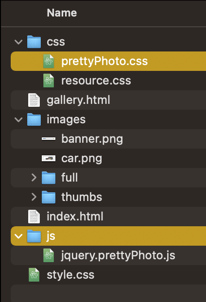
- The site folder contains the js folder (which contains jquery.prettyPhoto.js) and the css folder, which contains prettyPhoto.css and resource.css.
- In gallery.html, there is a snippet of code to go in the
<head>section, which loads the jQuery library from Google servers, and the prettyPhoto script and css from the site folder:
<script src="http://ajax.googleapis.com/ajax/libs/jquery/1.11.0/jquery.min.js"></script>
<script src="js/jquery.prettyPhoto.js"></script>
<link rel="stylesheet" href="css/prettyPhoto.css" media="screen">
- and code to go before the closing
</body>tag:
<script>
  $(document).ready(function(){
   $("a[rel^='prettyPhoto']").prettyPhoto({
     social_tools:false,
     animation_speed: 'fast', /* fast/slow/normal */
     slideshow: 5000, /* false OR interval time in ms */
     autoplay_slideshow: true, /* true/false */
     opacity: 0.80, /* Value between 0 and 1 */
     show_title: true, /* true/false */
   });
 });
</script>
- Finally, the code for each image needs to be structured like the images in gallery.html. Looking at this example, we have an embedded image <img> wrapped in an anchor <a> tag, which makes the image clickable.
The anchor tag’s href points to the full sized image, which loads when the image is clicked.
The anchor tag contains a rel attribute. This sets a relationship between the anchor and the page itself. In this case, it is a relationship to the prettyPhoto script. The image will also be contained within a group (or gallery) referred to as pp_gal.
<a href="images/full/bird1.jpg" rel="prettyPhoto[pp_gal]" title="Robin"><img src="images/thumbs/bird1.png" alt="Red and black Robin." /></a>Part 2: Animate the movement of the gallery thumbnails outwards along the x axis 100px
- In the
headsection of the HTML, notice the following three lines of code, which loads the jquery library from Google servers, and the prettyPhoto script and css from the site folder: - Notice the <script> code, which must be placed before the closing </body> tag. The javascript must fire after all of the elements that it needs to act upon have loaded. Some of these values, such as
animation_speedandopacitycan be changed based on your preference. - Locate the section prepared for Animation rules in the style.css file, just before the media queries begin. (Location within the file is not important — we’ll just put them here for organization.)
- Copy the below CSS class and paste into style.css in the Animation section:
.moveLeft {
   animation-name: moveLeft;
   animation-duration: 1s;
   animation-timing-function: ease-in;
   animation-iteration-count: 1;
animation-fill-mode: backwards;} - Copy and paste this keyframe rule into your CSS:
@keyframes moveLeft {
   from {transform: translateX(0);}
   to {transform: translateX(-100px);}
} - Create the appropriate code for
.moveRight - Add the classes
.moveLeftand.moveRightto the appropriate gallery thumbnailimgtags. - Save and test your gallery page.
Part 3: Animate each thumbnail to roll slightly inwards then outwards on hover
- Duplicate the CSS rules from part 1 by copying and pasting into new lines.
- Change the name of the keyframe rules and class names to moveLeftRotate and moveRightRotate.
- Add the :hover pseudo class to the CSS rule (e.g. .moveLeftRotate:hover)
- Also in the CSS rule, change the duration to 2s, and the timing-function to ease-in-out.
- Change the <img> class name to
moveLeftRotateandmoveRightRotate - Test your animation so far in Safari.
- Replace your
.moveLeftRotatekeyframe rule with the code below to add .5 rotation as the thumbnail moves 20px inward, out -250px at the 60% mark rotating 2x, then back to the starting point at the 100% mark, rotating in the opposite direction. Create a keyframes rule for.moveRightRotatemaking the necessary adjustments.@keyframes moveLeftRotate {
20% {transform: translateX(20px) rotate(0.5turn);}
60% {transform: translateX(-250px) rotate(-2turn);}
100% {transform: translateX(0px) rotate(2turn);}}
Part 4: Modify Transitions in Nav Link Hover
While the above keyframe based CSS animations provide great flexibility and creative opportunities, CSS3 Transitions can be used to quickly apply direct manipulations between two states of an object.
The css rule for nav li a:hover has a transition property with a value of 1s. That means that these hover properties will transition in from the normal non-hover state to the hover state over the span of one second.
Modify the values in nav li a:hover and observe how the changes appear.
nav li a:hover {
  color: #eea6a6;
  text-decoration: underline;
  background-color: #787878;
  transition: 1s;
}
For more details, see MDN’s “Using CSS transitions“.
Submit
Upload your completed Exercise 5 folder to Box. Make sure the folder name begins with your last name.