
CSS
CSS is a set of formatting rules that are applied to the HTML based on selectors and declarations.
Selectors determine which HTML element a style should be applied to, such as:
- tags:
<p> - classes: can be applied to any element, such as
<span class="boldRed">. In the CSS, class names begin with a dot, such as.boldRed. - IDs: specify a style for a single, unique element, such as
<div id="banner">. In the CSS, ID names begin with a #, such as#banner. - pseudo-classes: add custom looks and behaviors to certain selectors, such as a:hover. See MDN Pseudo Classes for more details.
Selectors can also be grouped or nested within each other. Grouped selectors apply the same rule to a number of different elements. Nested selectors may affect certain classes that are only within other classes.
Example:
h1, h2, p, li {
 }
Applies to the h1, h2, p and li tags.
#subnav li a {
 }
 Only applies to anchor tags within li tags in the #subnav element.
Declarations consist of a property and a value. The property is the style attribute (like color or margin) that you wish to change. Each property has a value (like “red” or “20px”).
Common CSS properties:
- color
- text-align
- line-height
- font-family
- font-size
- font-style
- font-weight
- background-color
- background-image
- background-repeat
- list-style-type
- margin
- padding
- border
- float
- clear
For a complete list of CSS properties, see MDN’s CSS Reference.
CSS Layout
divs and spans
- By default, browsers place a line break after each
<div>element. That can be overridden using floats (moves a<div>left or right) and clears (forces a line break left and right.) See MDN’s explanation of float and clear. - Create your
<div>tags in your HTML according to your flow analysis, and size and position them in CSS. - Most block level elements within your layout will require a width attribute in order to behave properly. Heights can be set if needed, otherwise it will be determined by the content within the element.
- To determine height and width, consider the CSS Box Model. Every box is composed of four parts defined by their respective edges: the content edge, padding edge, border edge, and margin edge.
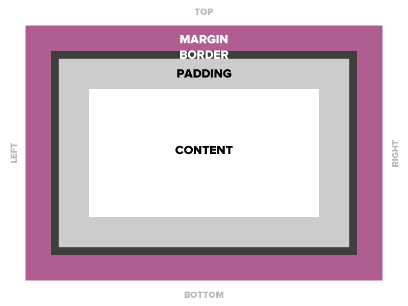
- Margin – Clears an area around the border. The margin does not have a background color, it is completely transparent
- Border – A border that goes around the padding and content. The border is inherited from the color property of the box
- Padding – Clears an area around the content. The padding is affected by the background color of the box
- Content – The content of the box, where text and images appear
The total width of the element in the example below is 300px:
width:250px;padding:10px;border:5px;margin:10px;CSS3 Responsive Box Model
With box-sizing: border-box; we can change the box model so that an element’s specified width and height aren’t affected by padding or borders, making responsive layouts easier to control.
* {
box-sizing: border-box;
}
Positioning and Overlapping Elements: CSS allows for elements to be positioned in the following ways:
- Static: HTML elements by default are static, according to the normal flow of the page.
- Fixed: Positioned relative to the browser window, will not move even if the window is scrolled.
- Relative: adjusted to a position relative to its normal position.
- Absolute: positioned relative to the first parent element that has a position other than static. If no such element is found, the containing block is <html>.
- Overlapping: The z-index property specifies the stack order of an element when it is positioned outside the normal flow. An element can have a positive or negative stack order.
For a detailed explanation, see CSS Positioning
Floats and Clears
Adding the FLOAT property to an element takes it out of the normal flow and moves it as far to the left or right of it’s containing element as possible (until it reaches the edge of its parent or butts up against another floating object.)
Any other elements, such as paragraphs or lists, will wrap around the floated element.
Always specify a width when floating an element, otherwise the element is likely to take up the whole page and not appear floated.
You can specify:
a) whether an element is floated or not, and
b) which side it floats to.
A CLEAR cancels a float.
Clear: right forces the next element in the flow to appear on a new line.
Clear:left forces a line break before the floating object. Clear:both puts an element on its own line, below all previous elements in the flow.
CSS Grid Layout and Flexbox
Grid and Flexbox are two recent additions to CSS that facilitate layout creation and element positioning, previously accomplished with inflexible tables and more recently, floats and clears. Grid provides a way to establish a two-dimensional (horizontal and vertical) responsive design system, while Flex gives greater control over the one-dimensional (either horizontal or vertical) distribution and spacing of elements within a container. It makes vertical alignment of objects much easier that with other CSS methods.
Add CSS Formatting to Your HTML
Instructions
- Download this image and place it into a folder named “images” inside your site folder.
- In VS Code create a New file and save it as style.css into your yourlastname-ex03 site folder.
- Copy the css code below, and paste it into style.css.
@charset "UTF-8"; /* CSS Document */
/* Universal Selector Reset */
* {margin: 0;padding: 0;box-sizing: border-box;}
/* End Reset */

:root {--body-color: #d5d7ff;}
body {
  background-color: var(--body-color);
  text-align: left;
  font: 11px/1em "Lucida Grande", Lucida, Verdana, sans-serif;
  min-height: 100vh;
}

#wrapper {
  margin: 0 auto;
  width: 960px;
}

h1 {font-size: 1.5em;line-height: 1.75em;color: #639;
margin-bottom: 1.75em;}
h2 {font-size: 1.3em;line-height: 1.75em;
margin-bottom: 1.75em;}

h3 {font-size: 1.1em;line-height: 1.3em;
margin-bottom: 1.3em;}
p {
font-size: 1em;
line-height: 1.3em;
margin-bottom: 1.3em;
}
header {width: 100%;background-color: #000;padding-top: 50px;
}
nav {padding-top: 3px;height: 40px;float: right;}
nav li {font-family: "Courier New", Courier, monospace;font-size:13px;white-space: nowrap;display: inline;list-style-type: none;padding-right: 1.5em;}
nav li a {color: #FFFFFF;text-decoration: none;font-weight: bold;}
nav li a:hover {color: #d5d7ff;text-decoration: underline;font-weight: normal;}
#banner {width: 100%;height: 50px;clear: both;background-image: url(images/banner.png);
background-repeat: no-repeat;
background-size: cover;}
main {width: 60%;margin-right:5%; float: left;margin-top: 50px;}
aside {width: 35%;float: right;margin-top: 50px; }
main img {
width: 50%;
height: auto;
}

footer {
clear: both;
width: 100%;
height: 2.5rem;
background-color: #ccc;
margin: 50px auto;
}
Add Interactive Elements
- Add CSS to the img rule to float the picture in the main div to the right, allowing text to flow around it to the left.
- Make the image clickable by wrapping the
imgelement in an<a>tag and assigning anhrefvalue ofhttps://www.birds.cornell.edu/. - Add pseudo-classes for
a:visited, to change the color of links that have been visited. - Change the image to black and white when moused over by creating a rule:
img:hover {
filter: saturate(0);}